A prescient program called “Robot Fonts” was devised and demonstrated by type designers/software wizards Erik van Blokland and Just van Rossum at the Fuse98 conference. The conference’s theme of “Beyond Typography” promised to be expansive and somewhat cagey on the topic. Live on the main stage, the program was set to work, seemingly spawning innumerable faces at the click of a mouse. As it churned out font after font, the proud paternals quipped that the only challenge now for designers was inventing names for all the output. It was a virtuoso performance of programming and showmanship. To this day, I’m still too tech-unsophisticated to know if the vans Blokand and Rossum actually engineered a perpetual type-making machine or if it was all an ingenious, rhetorical prank. Either way, they foretold a near-effortless future of infinite fonts and endless opportunity for colloquy about them.
That future is here and shows no sign of slacking. Faces and foundries have proliferated, with new styles in a variety of languages coming from all corners of the globe. Meanwhile, a plenitude of established and enthusiast forums service font fans. A devotee might skip from type workshop, to lecture, to symposium, to conference without pause. These exist as part of a flourishing ecosystem of type-centric events, activities, and competitions. If you’re jonesing for a hit of hinting, you can score with ease. Type talk is eclipsing nearly all other design discourse. And, perhaps deliberately, drawing attention away from other conversations.
Typography is the most “meta” design conversation possible. Nothing’s more self-referential than discussing the substance of written language: the concrete nature of the characters themselves. Type-related discussions have always been a vital and popular aspect of graphic design. Since typography is the unique aspect of graphic design practice, it’s reasonable to have a healthy complement of font fora. Reading and opining on imagery can equally, if not more prominently, be found in photography and illustration media. As platforms to talk type are flourishing, general interest journals on graphic design have shriveled or are struggling. More so now, where typographic product and discourse have become not only meta but mega.
As a desultory type observer, I’ve increasingly felt overwhelmed, especially when confronting the interminable font menu Apple and Adobe have imposed on my laptop. However, I’ve also exploited the abundance, dipping occasionally into the numerous free sample type offered by vendors. For a time, I exclusively used free faces in my design work, feelings confident in the improved quality of freebies available (whether I was promoting or exploiting is debatable.). This was in sharp contrast to the early 90s grunge-influenced vomiting of garish, phantastic and unusable faces.
The current trends in type are characterized by sobriety, practicality, and appeal. Conspicuous are a plateaux of lengthy, horizontally-stretched sans E’s and a wavery of noodly, high-contrast, serifed faces. There’s a lot to look at and it’s usually good looking. The overall increase in worthy typefaces has driven other notable developments in the field. Foundries appear to be the only reliable advertisers for publications like Eye, where every issue seems to be a Typography special. In branding, a new identity or refresh that doesn’t include a bespoke type family is an outlier. Whether it’s a perception or an actuality, good type is more common and affordable.
As amusing (or alarming) it is to imagine today’s type glut being due to a rogue program left running for 25 years, the actuality is readily apparent and mundane: there are simply more books and programs (academic and software) for aspiring type designers and subsequent practitioners of the art, probably more than at any other previous time. Contemporary economics and technology permit individual and small founders to craft, advertise and distribute their wares.
The Fuse98 conference and demo came toward the end of a decade of not only significant typographic exploration but also of critical ferment and fervent debate about type and all things design. The 1990s are acknowledged as one of the most contentious and adventurous in design’s history. To locate a comparatively provocative and productive period, we must look back to the beginnings of the Modernist project earlier in the 20th century. In both eras, typography lay at the center of the debates. Discussions about type design and deployment served as microcosms and proxies for a broader designer discourse. Criticism and typography both flourished, becoming almost symbiotic.
The most notorious forum for critical writing in the 90s was Emigre magazine, also a venue for Zuzana Licko and others’ type designs. Issues could contain in-depth examinations of typographic theory and wide-screen studies of graphic design practice. Subsequently, on-line curated compilations of broad-topic graphic design writing could be found not only at Emigre’s site but others dedicated first to typography.
But the increased type production and concomitant discussions of typography hasn’t led to an improved or substantive discourse. In a 2016 commentary on the Typographica web site, “Rejecting Infill-ism and Waterfalls of Mediocrity,” Stephen Coles stated: “With the aid of accessible tools and sales platforms, the rate of new fonts released increases every year; many of them are half-baked, landing on the shelf with gobs of hyperbolic promotion and no critical commentary.” He ended his article on a note of optimism, that “critical eyes and fearless voices” would emerge amid the profusion. To date, there’s been no follow up post assessing if those eyes and voices have materialized.
While absence isn’t evidence, it is suggestive. As noted, typography discourse has mirrored and supported a broader graphic design criticism. It’s still an ungratified aspiration that a full complement of boldly astute ocular oralists is present and respected in the profession. But there is also more at work: the relationship between typography and criticism has changed. More than overwhelming critical discussion, typography discourse has become not so much a distraction than a signal—affecting a deflection away from criticism. Type has become design’s safe word.
Making an analogy to S&M could seem strained—criticism may not literally be torture for graphic designers, but it’s usually described in terms of pain and pleasure—emphasis always on the former. And perhaps not so much pleasure as something that, if you swing that way, is potentially beneficial for practitioners: a performance enhancer.
As a design educator, devising the form of the critique and gauging how much is enough is an ongoing task. In the face of uncertain and equivocal response from students, I’ve pressed critique points to an extent that makes me wince in memory. My students and I would have benefitted from an agreed-upon signal to halt the proceedings. Some variation of the statement, “nobody really likes criticism,” is reliably voiced when the topic arises. But some carefully calibrated, time-delimited measure is deemed appropriate, even invigorating. Still, it’s something that must be borne, tolerated. At the 2016 AIGA National Conference held in Los Vegas, the affinity session “How to Survive Critique” quickly drew an overflow crowd. That criticism is something to “survive” broadcasts that it belongs to the realm of dis-pleasure. Of what went on during that 45-minute gathering, I can only speculate. I will testify that attendees emerged smiling and satisfied.
This may be because the critical practice graphic designers flirt with is implemental and practical. Work will be whipped into shape to become more attractive to clients. Serving as dom/dommes are eminent practitioners, instructing on and wielding tools that are guaranteed to bring clients to submission.
Though apparently pleasing, what happened in Vegas, stayed in Vegas. Subsequent conferences have lacked a repeat or follow-up. Meanwhile, the most visible and popular forum for what passes as graphic design criticism is Stefan Sagmeister’s Instagram feed. Here brevity and authority combine to form the ideal design “critical” experience. In a few short sentences, the renowned designer assesses select submissions from around the world. His statement of intent is characteristically forthright: “My instagram account can neither compete nor replace design criticism. I am not reducing something large to something small, I am creating something small where there was nothing before. Something small is better than nothing.” Substitution may not be Sagmeister’s intention with his micro-crits, but it’s what they effectively accomplish. If all the supplicants vying for his social media attention additionally sought out and supported the stuff he doesn’t do, we’d have a different design landscape.
Now, that vista is largely a featureless plain. Of prominent engagements with criticism, the final volume of the Looking Closer series was published in 2007. Could a new volume be assembled, even with 16 years of potential writings to choose from—a span three years longer than between numbers 1 and 5? Most importantly, would there be a market?
It’s not a good look to reject criticality outright. Endlessly inventive—and evasive—with typography, graphic design indulges in a way to talk about graphic design without really talking about graphic design. It gives the impression graphic design is under consideration. But, at best, it’s a synecdoche—a part standing in for the whole. The ultimate purpose is avoiding a full accounting. Emphasizing type and elevating its discussion draws attention away from the larger void in our discourse. This de-emphasis has led to revisionist histories of prominent critical voices. Emigre magazine is often categorized as a journal of typography or primarily a catalog of their products. The critical writing aspect is assigned secondary status, if mentioned at all. Articles directly addressing type were regular components of the magazine, as were demonstrations of Zuzana Licko’s (and others) creations. But making the many critical writings subordinate or dismissing them entirely when characterizing the magazine distorts the substance of the publication.
Design’s cacophony of type talk may be another response to the ongoing wider, popular interest in design. As the PC brought an amateur influx of makers that threatened designers’ livelihoods, the Internet has promulgated a vast, untrained criticism. Design is lamenting and searching for its authority in a pluralized discourse. One way to reclaim authority is to turn inward, into minutia.
Even if focusing on type, there’s a contemporary absence of what was a hallmark of earlier times of prolific typographic production and discussion. Missing are overarching arguments and broader opposition to established order. Divisions over the founding, interpretation and disposition of type were impassioned and often generational. Current typographic discussions are overwhelmingly genial. No alternate typographies are being proposed, no variances to established methods. We’re all good: one big happy font family, bonding over our disdain for the abomination that is Papyrus. Type is being created for the sake of it. What’s wrong with that?
Ironically, or perhaps fittingly, it was Rudy VanderLans that struck some sparks with his comments about “in-fillism,” previously referenced by Stephen Coles. That flash was quickly quenched and the trends toward “a tangible vacuousness” carried on. It is possible that discord is over-prized, the criticism needn’t equal conflict. Perhaps it’s a sign of maturity: design now accepts a diversity of expression and plurality of practitioners.
This may be belied by the notable exceptions, where typography and critical commentary combine to illustrate where work still needs to be done. Tré Seals is investing type design with a conscience and substance. His Vocal Type products draw from events in civil rights history to inject criticality into form.
Seals was prompted by his frustration at the lack of BIPOC representation in design history. “I decided to find a way to increase diversity and empathy in the design industry. I knew I couldn’t just change the demographics or the education system. So I tried to figure out a way to introduce a non-stereotypical piece of minority culture into the design itself, starting with the basis of any good design — typography.” Seals’ typefaces change the focus of graphic design. In one way, truly shifting attention outward towards design’s users, illuminating the audience historically left behind and overlooked. At the same time, the look is turned inward to the profession, and its lack of diversity and representation.
Historically, the emphasis in type design has been designer-centric. Type founders have eagerly and often self-importantly demonstrated their faces in use—with monied culture the choice user. Seals inverts this perspective, drawing attention to type’s users, and the greater callings the humblest letterforms may be set to. Also, flawed efforts such as Dyslexie and OpenDyslexic (maybe even Sans Forgetica) are considerate examples of user-centered typographic design. At the least, they’ve provided further evidence that familiarity is still the overriding determinant of readability. The danger is that type designers will use this as further license for self-aggrandizing.
Amid the typotalkic chaff there are examples of critical acuity. The desire to create letterforms can still be synergetic with the need to say meaningful things with type. However, the ratio of glitter to goods skews far to the former.
When recalling the 90s, the thought occurred that I may suffer from a nostalgia for those days’ disputes and drama. I was a contributor to that time’s critical climate, which has cooled precipitously. I dreaded turning into a conservative figure bemoaning the paltry present like the people I tormented decades ago. However, I’m not promoting a specific agenda but something that’s reflective of and engaged with the now. It would be an enhancement of today, not a return to any yesterday. And my call for a spirited critical literature is longstanding, especially back then. We’ve never had a sustained, supported critical condition in design. In its place currently is a surplus of entertaining but inessential type talk. Whether it be those times or these, I don’t think I’m missing anything.
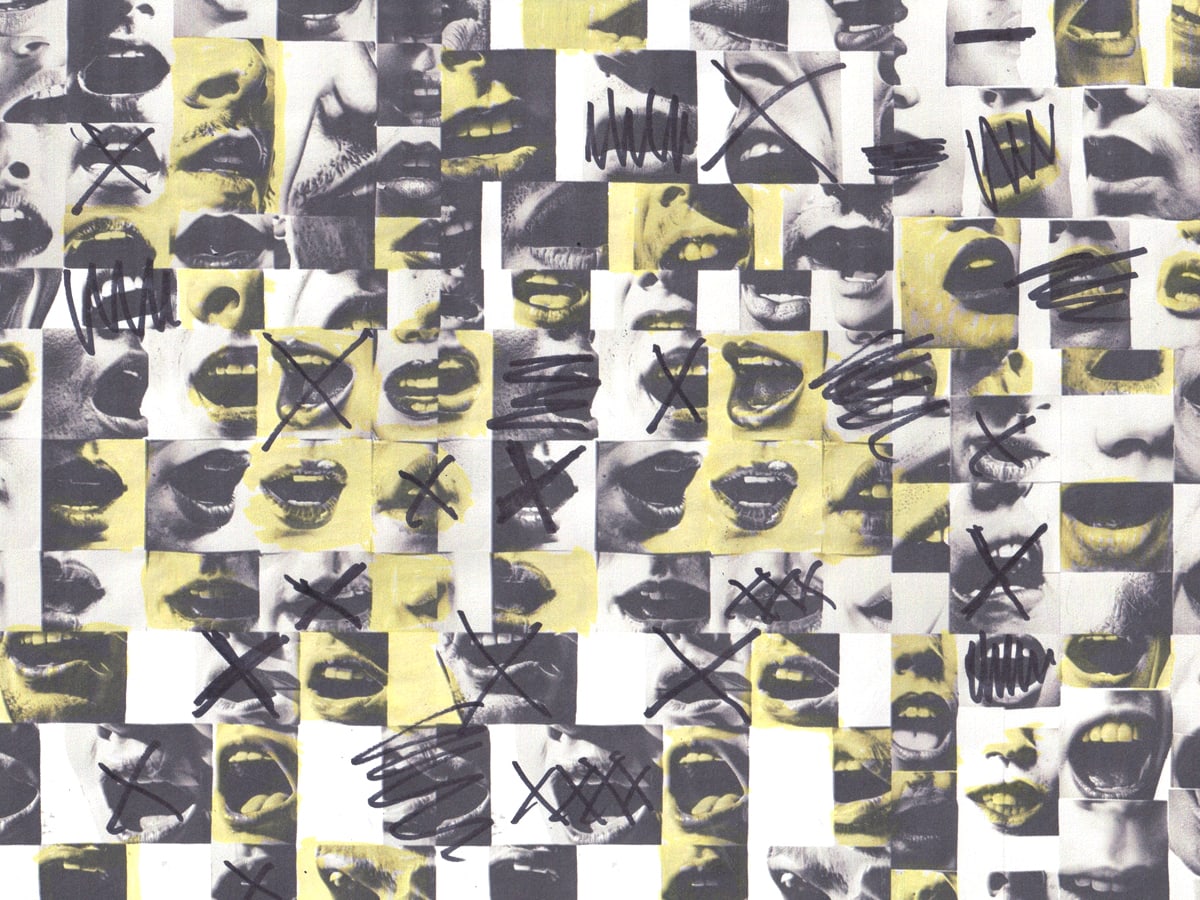
Hero image by Stephan Rosger.