Editor’s Note: Archigram: The Magazine is a new Kickstarter project from D.A.P. and Designers & Books that is reissuing “architecture’s most influential, innovative, and beloved underground magazine” in a new box set alongside extended essays and texts putting the magazine into historical context. We at Scratching the Surface are long-time fans of Archigram and immediately backed the project so we’re excited to be republishing an excerpt of one of the essays by David Grahame Shane.
In 1963 the first-year studio at the Architectural Association school stretched across the top three floors of the elegant Georgian town houses facing Bedford Square, beside the British Museum. The intake of 100 students (25 women) sat at drawing boards across the room. The first-year master, Tony Eardley, had been a star student of the Smithsons, recently teaching the New Brutalism with them, James Stirling, and Colin Rowe at Cambridge. His personal assistant was Julia Bloomfield, the future managing editor of Peter Eisenman’s Oppositions magazine in New York. Across this vast room one afternoon a fifth-year tutor, Peter Cook, went from desk to desk, trying to sell Archigram 3 to students, some of whom would in the future build Rogers and Piano’s Pompidou Center, eventually becoming Rogers’ partners or founding their own firms like Alan Stanton. Others would have distinguished careers in public housing (including Benson and Forsyth) or in the new housing cooperatives (like Jessica Dunham).
Peter had a hard time selling issue 3 that day. The studio was heavily infected with Team 10 tutors. Le Carré Bleu, a small square French architectural magazine, passed beneath the desks. New Brutalism was the rage—Stirling and Gowan’s Leicester Laboratory was completed that year. Gowan presented the project to a packed house at the AA, where he taught in the fifth year. First-year students also created their own magazines. I was involved with Justin De Syllas and Jasper Vaughan creating Symbols, heavily criticized by fellow student Rodney Mace in the AA Quarterly, while Robin Evans and John Frazer made Rather Symbols Than Signs in response. All were supported by grants from the student association president Alan Littlewood. Little did we realize the role Archigram would play in our lives, as Peter would be our fifth-year master and Archigram members would be our tutors, appearing as critics throughout our careers.
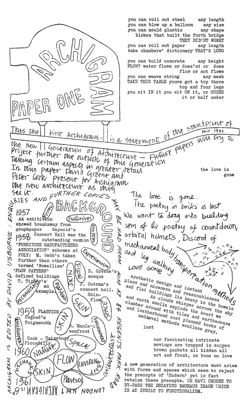
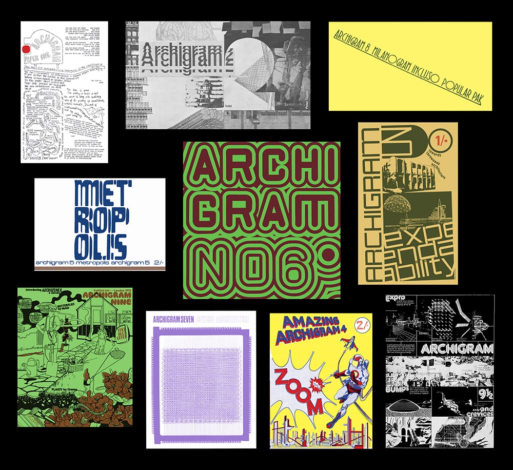
Archigram 1. Courtesy D.A.P.
Looking back at Archigram 3 now I realize it was an important inflection point in Archigram’s evolution. The first issue was like a student production created by Peter, David Greene, and Mike Webb, the rising star of the London Polytechnic. Mike, whose thesis was failed by his tutor Jim Stirling, had his “Bowellism” Furniture Manufacturing Association headquarters project shown at MoMA in New York in 1958, thanks to Reyner Banham. This was the key image of Archigram 1fi. His Leicester Square Sin Centre project, with its spiral parking ramps—also failed—was the key image of Archigram 2. Tiny cameos from Peter, David, and Cedric Price surrounded it. The issue also included the Pimlico housing competition by the future Archigram members Warren Chalk, Ron Herron, and Dennis Crompton, all working at the LCC.
To this young teenage student, it was the collage layout and Peter’s lettering that looped around key words like skin, energy, or flow that stood out, and still stand out, in Archigram 1 and 2. This flexibility reflected a new fluid take on modernism, inspired in part by the spiritual organicism of Frederick Kiesler’s Endless House (as I discovered years later interviewing Mike). Archigram 3 demonstrated Dennis Crompton’s production expertise and funding from some competition wins. The key image for me was the Sheffield shopping mall design with capsules and cranes by David and Peter, who had met at Cubitt’s office. David considers this to be “the first Archigram project.” David also in this period worked on “The Thing” with Mike Webb, collaging texts with critical aphorisms under their work desks at Architects’ Co-Partnership. David wrote aphorisms like “We have chosen to bypass the decaying Bauhaus image which is an insult to functionalism,” which would later feature in the iconic science-fiction comics speech bubbles of the Pop-inspired Archigram 4 (collaged in by Dennis).
I think Peter Cook made few sales that visit. As first-year students of Eardley, we had plenty of Bauhaus and Le Corbusier, along with a Team 10 expedition to Ford’s Dagenham Works to show the possible future mass production of housing capsules. We also had a 24-hour-long Buckminster Fuller lecture up in our studio. His acolyte, the spatial geometer and William Blake fan Keith Critchlow, was an influential tutor in the year. I regret I did not buy the Archigram 3 “Expendability” issue or the pop-up Archigram 4 that appeared shortly afterward in 1964. By then our year was fragmented in small studio rooms across the school. The magazine was for sale at the excellent architectural bookstore Tiranti’s in Charlotte Street, close to the AA.
Archigram 4 marked another inflection point as the magazine took off. Warren Chalk’s comic-book, Pop, Zoom cover imagefig marked an important imaginative turn for the group. David’s aphorisms added an architectural bite to the comic mix, building on Mike’s Bowellism beyond the New Brutalism. The key image here was Warren’s fold-up, sci-fi, comic-book city with supertall towers by Archigram members. Dennis organized the weekend cutout and paper architecture gluing sessions. Peter provided another key image in his Plug-In City with its supertall towers containing Warren’s radial Plug-In residential units. This, with Warren and Ron’s City Interchange project, illustrated Archigram’s turn to urban design. The issue also advertised the group’s Living City exhibition at the ICA with its media-oriented, atmospheric, environmental “gloops.” Finally, all group members began working together under Theo Crosby at Taylor Woodrow’s research department in a shed at Euston Station, with Banham writing enthusiastically in support.
I think the Archigram 5 “Metropolis” issue of 1964 was the first one that I bought as the school curriculum also made a turn toward the urban, in second year, to the design of a street market in Bermondsey. In our third year we designed a large housing estate in Camberwell, South London, and then a new-town project for a proposed Thames estuary airport near the Isle of Sheppey. Warren Chalk’s urban turn in \#4, disguised as sci-fi, perfectly captured the scale change of the projects in our studios. Ron Herron’s Walking City appeared as the key image of the “Metropolis” issue. Dennis’s Network City drawing pointed to his advanced appreciation of the increasing digitalization of architectural production and urban life, a global trend that would provide a theme for Archigram 7. Another prompt for the urban turn was contact with the Japanese Metabolists, probably first seen in L’Architecture d’Aujourd’hui. The “Metropolis” issue featured the flowing curves of Kurokawa’s 1961 Helix City. I have a vague memory of seeing a tiny image of the Situationist Naked City 1956 collage by Guy Debord and Asger Jorn around this time, an urban fragmentation like Ron’s Walking City, but not in Archigram, as I had once imagined.
It is hard to identify a key image from Archigram 6, despite its strong cover design. I bought it when it appeared in 1965, in my third year. Perhaps the key image was Warren Chalk’s 1940s retrospective collage of 35mm contact sheets, emphasizing the paradigm shift from wartime inventions to postwar consumerism, contextualizing his earlier Pop art obsession. As a counterpoint, Peter provided a study of educational networks, illustrating his very cool University-Node Plug-In/6 for Euston Road, though this was not nearly as dynamic or exciting as the Plug-In City. He also illustrated the AA student Tony Grimshaw’s long-span (unobstructed, columnless) grid over Covent Garden with huge, open floors beneath the sheltering roof. These ideas related to Cedric Price’s earlier Fun Palace design with Joan Littlewood (1959–61), whose fabulous drawings—now in the collection of MoMA —were largely unknown by us students in London at the time, and never published in Archigram. In the US, David and Mike both produced capsule designs after a visit to Cape Canaveral with Warren, but they did not appear until issue 8 (1968). Even in 1970, after winning the Monte Carlo competition, the dispersed group relied on sending drawings by mail as they produced Archigram 9.

This essay is an adapted excerpt from Archigram: The Magazine, a new Kickstarter project from D.A.P and Designers & Books. It’s been republished with permission from the publishers and author. Be sure to support the project on Kickstarter!